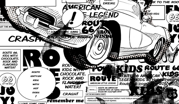
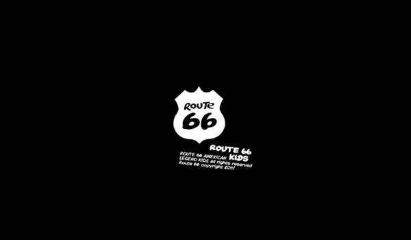
Route 66 Argentina entrusted the redesign to us of the line of art for the Kids line of the brand. The developed concept understands the creation of a graphical of smaller hardness and but connected stylisation with the outlines of a boy. The typography under the sign premise worked and the shield like container of new line of the brand was maintained. The graphical development of the global concept is inspired by the comic´s, the visual loudness of Liechtenstein and a monochrome language come off the first brand.